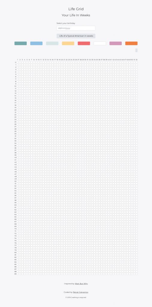
I made this quick data visualisation tool to show how human life in weeks looks like. I was inspired by WaitButWhy article.
If we take a 90-year human life and split it into 52 weeks per year this is how it’ll look like:
You can play with it here:
https://life.renatello.com/
How to use it
I’ve made an example of how the life of a typical American in weeks look like. You can find this example on top of the page.
Alternatively, you can submit your date of birth to see how many weeks you’ve already lived. This one is actually really scary as you’ll be surprised how fast time flies and how short our life is.
Drag “or” drop
You can create a new grid and paint individual weeks “cells” with the appropriate colour to demonstrate a period in your life e.g. your college time or working as an intern in Google.
You can drag a colour box over multiple cells to paint them. To do that you need to first enable a paint bucket tool (a pencil icon), see the image below.
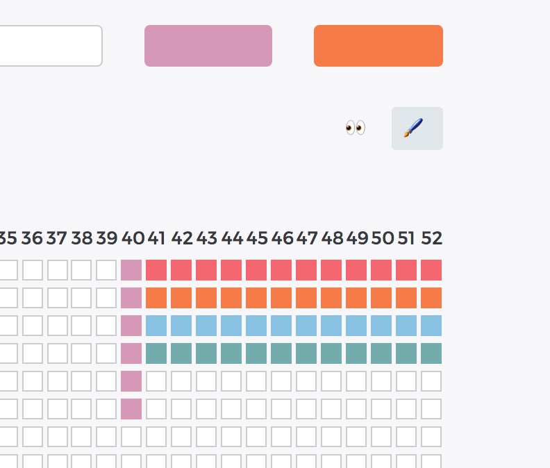
If you want to paint an individual week you can click on the cell and pick a colour or disable the “paint bucket tool” and then drag and drop a colour box.
Save your life in weeks
When you’re done you can save your “life grid” by clicking the save button and adding a title for your grid.
You can also share your grid with others. You need to save it first to get a sharable link.
Split weeks by 10 years
To make it more user-friendly I’ve added a “toggle years” feature. It will split the grid into 10-year sections. See the example below.
Have fun playing with it and don’t forget to share your feedback in the comments section below.
Cheers,
Renat Galyamov
Want to share this with your friends?
👉https://life.renatello.com/
PS: check out my 7-day workout plan [for developers] and why you should quit your 9-to-5 job.